
- CSS
- Transition
- Transformation
- Animation
- Media Query
Transitions
어떤 상태에서 다른 상태로의 "변화"를 애니메이션으로 만드는 방법
어떤 상태에서 다른 상태로 가는 변화를 애니메이션화 하는 것
<!DOCTYPE html>
<html lang="kr">
  <head>
    <title>Document</title>
    <style>
      a {
        color: wheat;
        background-color: tomato;
        text-decoration: none;
        padding: 3px 5px;
        border-radius: 5px;
        font-size: 55px;
      }
      a:hover {
        color: tomato;
        background-color: wheat;
      }
    </style>
  </head>
  <body>
    <a href="#">Go home</a>
  </body>
</html>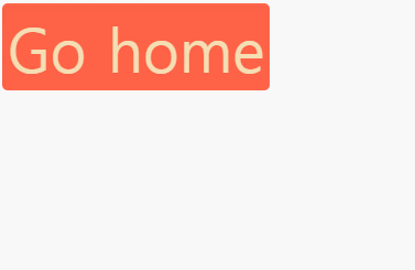
마우스를 올리면 색깔이 반전되지만 애니메이션은 없음
변화가 아주 갑작스럽게 일어나고 있음
서서히 변하거나 부드럽지 않고 아주 빠르게 변하고 있음
이럴 때 필요한 것이 transition
transition이라는 속성은 state가 없는 요소에 붙여야 함
예제에서는 hover가 있는 쪽이 아니라 없는 쪽에 써야 함
transition:
1. 어떤 것을 변화하게 만들 것인지 써야 함
배경색에 변화를 주고 싶음 (왜 배경색이냐면 변화하는 부분이 배경색이기 때문)
원하는 것은 배경색의 transition
2. 얼마 동안 변화가 일어나게 할지 정해야 함
3. ease-in-out
transition: background-color 10s ease-in-out;
a {
  color: wheat;
  background-color: tomato;
  text-decoration: none;
  padding: 3px 5px;
  border-radius: 5px;
  font-size: 55px;
  transition: background-color 10s ease-in-out;
}
마우스를 올렸을 때
- 텍스트는 바로 빨간색으로 변화
- 배경색은 10초 동안 천천히 밀색으로 변화
마우스를 내렸을 때
- 텍스트는 바로 밀색으로 변화
- 배경색은 10초 동안 천천히 빨간색으로 변화
이게 바로 transition
더 많은 transition을 추가하는 것도 가능
글씨 색도 변경하고 싶을 경우
transition: background-color 10s ease-in-out, color 5s ease-in-out;
기억해야할 점
background-color나 color 모두 hover에서 바꿨기 때문에 적용되는 것
transition이 hover에 있는 background-color를 찾고, background-color가 hover일 때 달라져 있으면 그 변화를 애니메이션으로 바꾸는 것
변화하는 모든 것에 transition을 주고 싶은 경우
transition: all 5s ease-in-out;
이 경우 all은 background-color와 color
정리
규칙1> transition은 state가 없는 엘리먼트에 사용
만일 state에 변화를 준다면 (ex. hover) 마우스를 떼면 원 상태로 바로 돌아감
규칙2 > 변화시키고자 하는 것들은 state에 꼭 있어야 함
ease-in function
브라우저에게 애니메이션이 어떻게 변할지 말해주는 것
디폴트로 가지고 있는 것은 linear, ease-in, ease-out, ease-in-out, ease
- linear: 무언가를 직선으로 움직이게 만들어줌 (같은 속도 좌우 직선으로 움직임)
- ease-in: 시작점에서보다 빨라지면서 움직임
- ease-out: 끝에서 느려짐
- ease-in-out: 느리게 시작했다가 가속하고 느려지면서 끝남
다른 옵션들도 많음
ease-in function의 차이를 느낄 수 있는 사이트
Ceaser - CSS Easing Animation Tool - Matthew Lein
Choose an easing type and test it out with a few effects. If you don’t quite like the easing, grab a handle and fix it. When you’re happy, snag your code and off you go. Now that we can use CSS transitions in all the modern browsers, let’s make them
matthewlein.com
cubic-bezier은 transition을 처음부터 끝까지 개인 취향에 맞도록 만들고 싶을 때 사용
transition: all 1s cubic-bezier(0.6, 0, 0.735, 0.045);
요약
transition은 state에 따라 바뀌는 property를 갖고 있으면 사용 됨
변화를 애니메이션으로 만들고 싶으면 transition을 사용
Transformation
엘리먼트를 transform(변형)시킬 수 있음
<!DOCTYPE html>
<html lang="kr">
<head>
<title>Document</title>
<style>
img {
border: 5px solid black;
border-radius: 50%;
transform: rotateY(85deg);
}
</style>
</head>
<body>
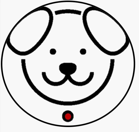
<img src="img/dog.png" />
</body>
</html>
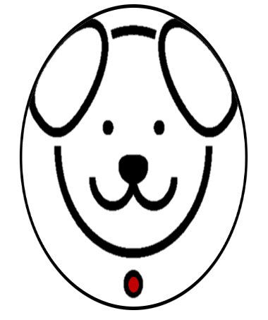
transform: rotateY(90deg);
90도는 1자이기 때문에 볼 수 없음
transform: rotateY(85deg) rotateX(20deg);
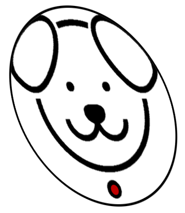
transform: rotateY(85deg) rotateX(20deg) rotateZ(10deg);

transform: scaleX(4);
X축으로 scale(크기 변경)을 4배로 만들어 줌
transform: scaleY(12);
Y축으로 scale(크기 변경)을 12배로 만들어 줌
transform: scale(2, 2);
X, Y 방향으로 둘 다 2배씩 크게 함
transform: translateX(-60px);
왼쪽으로 -60px만큼 옮기기
transformation을 적용시키긴 하지만 다른 형제(sibling)을 변화시키진 않음
<!DOCTYPE html>
<html lang="kr">
  <head>
    <title>Document</title>
    <style>
      img {
        border: 5px solid black;
        border-radius: 50%;
      }
    </style>
  </head>
  <body>
    <img src="img/dog.png" />
    <span>abcdabcd</span>
  </body>
</html>
transform: translateX(100px);

텍스트는 이동하지 않음
transformation은 box element를 변형시키지 않음
margin, padding이 적용되지 않음 (일종의 3D transformation이기 때문)
다른 요소의 box를 변형시키지 않고 원하는 요소를 이동시키기 위해서 사용하는 것
transformation은 다른 box element, 이미지에 영향을 끼치지 않음
span은 이미지가 원래 그 자리에 있다고 생각함
span은 이미지가 움직였다는 것을 알아차리지 못함
transformation은 페이지의 픽셀의 다른 부분에서 일어나기 때문
transformation은 box 차원에서 일어나지 않음
transformation은 transition이랑 조합 가능
<!DOCTYPE html>
<html lang="kr">
  <head>
    <title>Document</title>
    <style>
      img {
        border: 5px solid black;
        border-radius: 50%;
        transition: transform 3s ease-in-out;
      }
      img:hover {
        transform: rotateZ(90deg);
      }
    </style>
  </head>
  <body>
    <img src="img/dog.png" />
  </body>
</html>
transform: rotateX(90deg);

transform: rotateX(360deg);
transform: rotateX(360deg) scale(0.5);

"transform mdn"을 검색해서 matrix, translate, scale, skew, rotate 등 더 다양한 옵션들을 살펴볼 수 있음
Animations
마우스를 올려서 작동시키거나, transition을 사용하는 것 없이 계속 재생되는 애니메이션을 얻고 싶다면?
애니메이션을 만드는 규칙은 단지 @을 적으면 됨
@keyframse 애니메이션 이름 {
어디에서 (from)
어디까지 (to)
}
<!DOCTYPE html>
<html lang="kr">
  <head>
    <title>Document</title>
    <style>
      @keyframes coinFlip {
        from {
          transform: rotateY(0);
        }
        to {
          transform: rotateY(360deg);
        }
      }
      img {
        border: 5px solid black;
        border-radius: 50%;
        animation: coinFlip 5s ease-in-out;
      }
    </style>
  </head>
  <body>
    <img src="img/dog.png" />
  </body>
</html>
무한히 반복하고 싶을 때는 animation: coinFlip 5s ease-in-out infinite;
기능을 조합하는 것도 가능
<!DOCTYPE html>
<html lang="kr">
  <head>
    <title>Document</title>
    <style>
      @keyframes coinFlip {
        from {
          transform: rotateY(0);
        }
        to {
          transform: rotateY(180deg) translateX(100px);
        }
      }
      img {
        border: 5px solid black;
        border-radius: 50%;
        animation: coinFlip 2s ease-in-out infinite;
      }
    </style>
  </head>
  <body>
    <img src="img/dog.png" />
  </body>
</html>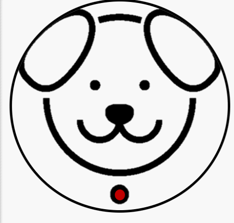
그렇지만 transformation의 마지막에 100px 움직여서 끝나는데 시작은 다시 원위치에서 하므로 예쁘지는 않음
되돌리기도 애니메이션으로 만들기
<!DOCTYPE html>
<html lang="kr">
  <head>
    <title>Document</title>
    <style>
      @keyframes coinFlip {
        0% {
          transform: rotateY(0);
        }
        50% {
          transform: rotateY(180deg) translateY(100px);
        }
        100% {
          transform: rotateY(0);
        }
      }
      img {
        border: 5px solid black;
        border-radius: 50%;
        animation: coinFlip 3s ease-in-out infinite;
      }
    </style>
  </head>
  <body>
    <img src="img/dog.png" />
  </body>
</html>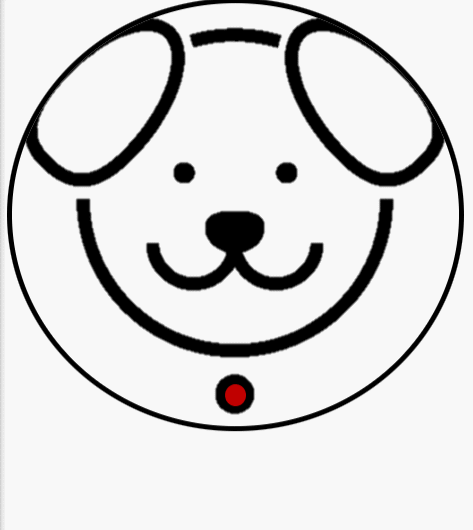
원하는 만큼의 많은 스텝을 가질 수 있음 (1%, 25%, 75% 등)
두 스텝만 필요하다 하는 경우에는 from - to
transform이 아니라 다른 property도 사용가능
하지만 애니메이션으로 잘 되지 않는 속성도 있으므로 transform을 권장
Media Query
오직 CSS만을 이용해서 스크린의 사이즈를 알 수 있는 방법
반응형 웹사이트를 만들 때 사용
media query는 조건을 추가할 수 있는 방법
조건이 참이라면 CSS를 실행하라고 알려주는 것
media query의 안에 원하는 모든 CSS를 넣을 수 있음
media query는 and를 써서 연결
<!DOCTYPE html>
<html lang="kr">
  <head>
    <title>Document</title>
    <style>
      body {
        display: flex;
        height: 100vh;
        align-items: center;
        justify-content: center;
      }
      div {
        background-color: teal;
        width: 200px;
        height: 200px;
      }
      @media screen and (max-width: 600px) {
        div {
          background-color: tomato;
        }
      }
    </style>
  </head>
  <body>
    <div></div>
  </body>
</html>
이 스크린이 600px보다 작으면 div의 배경색을 토마토색으로 바꿔라
@media screen and (max-width: 600px) {
div {
background-color: tomato;
}
}

더 많은 조건을 만드는 것도 가능
오직 650px와 750px 사이에 있을 때만 적용
@media screen and (min-width: 650px) and (max-width: 750px)
<!DOCTYPE html>
<html lang="kr">
  <head>
    <title>Document</title>
    <style>
      body {
        display: flex;
        height: 100vh;
        align-items: center;
        justify-content: center;
      }
      div {
        background-color: teal;
        width: 200px;
        height: 200px;
      }
      @media screen and (max-width: 600px) {
        div {
          background-color: tomato;
        }
      }
      @media screen and (min-width: 601px) and (max-width: 700px) {
        div {
          background-color: wheat;
        }
      }
      @media screen and (min-width: 700px) {
        div {
          background-color: turquoise;
        }
      }
    </style>
  </head>
  <body>
    <div></div>
  </body>
</html>
배경색 teal은 볼 일이 없음

태블릿이나 스마트폰의 가로 모드, 세로 모드도 지정 가능
<!DOCTYPE html>
<html lang="kr">
  <head>
    <title>Document</title>
    <style>
      body {
        display: flex;
        height: 100vh;
        align-items: center;
        justify-content: center;
      }
      div {
        background-color: teal;
        width: 200px;
        height: 200px;
      }
      @media screen and (min-width: 601px) and (max-width: 1200px) and (orientation: landscape) {
        div {
          background-color: wheat;
        }
      }
    </style>
  </head>
  <body>
    <div></div>
  </body>
</html>
가로 모드: (orientation: landscape)
세로 모드: (orientation: potrait)

이외에도 많은 종류가 있음
min-device-width
이 쿼리는 오직 핸드폰에만 적용 (데스크톱 브라우저는 이해 못 함)
media의 타입도 있음
@media print
프린트할 때의 모습
'프로그래밍 > CSS' 카테고리의 다른 글
| [CSS] box-sizing (0) | 2022.03.30 |
|---|---|
| [CSS] BEM, reset, not, inherit (0) | 2022.03.29 |
| [CSS] flex, selector, state, variable (0) | 2022.03.27 |
| [CSS] HTML, CSS (0) | 2022.03.25 |